Saturday, June 30, 2012

America Banner

I had different flag backgrounds I was looking to work with. For this project I chose this one, but I'll be using others for a couple more.
All I did is type the letters. I used Pacifico and United States fonts. I applied a white acrylic style (Wow comes with PSE), then, because the background was too strong I put a black stroke on them. It didn't look good, so I changed it to white. Still didn't look good, so I tried red and it did make the letters stand out more.
I used a shape on the background. I was looking for a frame when I came upon the banner, so I used it. I looked at it and realized the whole thing was the flag, so I duplicated the background and took out everything except the rod. I applied a gold style to it. I cut out the rod from the main background and then, when they looked good together I merged the layers.
Have a great weekend!
Patricia.

Friday, June 29, 2012

Summer Cluster

I worked on this for a little while.
I started out with a frame already made and when the whole thing was done, I didn't like it, so I replaced it with the simple square frame and gave it a blue glass finish.
The flip flop came from Manu's template. I added the flower to make it even more tropical.
The palm tree is a shape. I gave it one of Mithrilhall's styles, to match the flip flops.
The wave is also a shape. It came as a single wave, so I copied it three times more, merged the layers together and worked on it a bit, so the seams wouldn't show, then I gave it another of Mithrilhall's styles.
The phrase was done in Pacifico font, and it's very close matched to the wave's style, but it has green in the center. However, since it wasn't clear enough, I added a white stroke to it.
The folder is zipped, but there are four .png files in it: frame & wave, flip flop, palm tree and phrase.
Hope you enjoy it!
Patricia.

Thursday, June 28, 2012

I Love Summer

And who doesn't?
I worked on a common phrase that can be used in any summer layout.
For the clothespins and tags I used Zaza's clothespins template (http://scrapandtubes.blogspot.com).
I colored the pins and the rope (everything comes greyed out). I cleared out the letters from each tag, then I put a soft overlay on each one (sand) and gave it the aqua color.
I typed the letter I in Venezio font. Added the heart clip art and gave both the red blacklined style. If you don't have it, just colour your letter and/or clip art in the color you want (ctrl +U) and then give it a black stroke, size 4. Add some shadow.
I then added the cute flip flop charm and copied it 5 times more, one for each tag. I got the charms from AtomicCupcake.com, who's now has closed shop.
Everything is about 3x6 in, a .png file.
Enjoy your day and summer!
Patricia.

Wednesday, June 27, 2012

Stickers

I have a few cute clip art that I wanted to share as stickers.
You just give them a white stroke, depending on the size of the image. If it's just 5px wide and your image is big, it won't look good. So you have to play a guessing game until they look good.
After that, you can just use the stickers and give them a shadow, or you can give the whole image a beveled look, and then add the shadow.
So have fun, and enjoy the lazy days of summer.
I will start working on some summer projects soon.
Patricia.

Tuesday, June 26, 2012

Purple QP

I'm offering a cute purple quick page as a freebie.
I used one of SG Trashed papers. I added some brushes in the same shade of purple and in the layer box I gave them a Hard Light look, which brought them up without making them too obvious. I wanted to make the paper a bit more trashed and grunged than it already was.
I got a clip art that has a swirl and a butterfly and added a colorful style to it.
I got a frame that I liked and gave it a silvery, textured style. Then I added the bow and wrap, clicked on control and U and gave it the same shade of purple as the background paper.
There are 3 layers in this .zip file: background & embellishment, bow and wrap, and frame.
The background paper has a tear, if you print it the way it is, it will show a white behind the paper. You can add an extra layer with another paper if you like.
You also add your own title design, that way you can use it for anything. Enjoy!
Patricia.

Monday, June 25, 2012

Graduation

Today I have something for those who are scrapbooking graduation pages.
Since there's no way I can do all the different colors for each school,  I just came up with generic shapes and colors: boy, girl. I turned them into stickers and added two 'congratulations' phrases, one horizontal and one vertical, with two different styles.
I hope you can use them!
Patricia.

Saturday, June 23, 2012

The Wind Beneath my Wings

I really had nothing for today. So I'm reaching.
I liked the idea behind the phrase. I liked the bird shape, I used Scrap Cursive and Sylfaen fonts.
In the background I cut the sun spray (I think that's what's called) in another layer, so I could color it in one shade and put another shade behind it.
I gave the phrase a Retro look and voilá, that's it.
I like it. The whole thing looks like a poster from the 70's. It's a JPG file, about 7x5 in. Not too big.
Have a great weekend!
Patricia.

Friday, June 22, 2012

Happy Birthday

A friend's birthday is coming up, so I designed this sign.
First of all I cut the shape of the cake and gave it a style, and got that out of the way. That was the easy part. I liked that shade of pink and the cake looked good. I debated between the shape and a clip art. This won.
Then came the more dificult part. I didn't know which way I was going to go. Then I decided to put the HAPPY (United States font) behind the shape. The problem was the look for the letters. Just dark, or  something better? After many tries, I liked the glittery style I found.
I typed 'birthday' in Storybook font. First I had some confetti I wanted to mask with, then I just ended up with the gold style, after I added the 2U and matched them.
I added a rectangular background and another gold style, so the whole thing looks like it's a raised plaque.
Hope you like it.
Patricia.

Thursday, June 21, 2012

Exquisite & Beautiful

I was playing with one of the words when I decided to offer two. Set with the same font: Wilderness, it has enough curls that I can add a swirly design.

For 'beautiful' I added a swirl that had a flower right in the center, so I just erased it, since I wanted the letters to take center stage. I applied a red style with a silver border. I added the letters each one individually, because I wanted to position them myself. After that I merged the layers together, so they don't go anywhere without me knowing. I know, controlling. Ha, ha, ha.

I finally added a style that would hollow out the letters and make them pop up.

For 'exquisite' I colored the letters in orange, then added a style that would only add silver to the outside of them, leaving the color untouched. If you have a lot of styles, you can spot these kind because the inside of the box is empty.

I added the swirl and doubled the layer. I put one in front and one behind of the words. Then I erased some portions of the one that was in front (above) the word 'exquisite' because some of it was too much. I added a soft style to both of them, a style that had some silver to resemble the borders in the word, but didn't merge the layers, because it turns into a mess.

And that's pretty much it.

I don't give names of styles because I've had them for a while, downloaded them from who knows where, and probably changed the names in the process (so I know what they do).
I hope you get inspired to make your own. Good luck!
Patricia.

Wednesday, June 20, 2012

Wonderful

I saw a word surrounded by a busy background and thought I'd try something similar.
I piled a bunch of different flower pics I have until I couldn't see the background. Then I merged all the layers together.
The following you can do two different ways: while right-clicking on the type tool choose the 'horizontal type mask tool,' and then type your letters and erase, or you can choose the Magic Wand tool and while holding the shift key down add all the letters together and then erase.
I used two different fonts: Storybook and LD Licorice. I also like Scriptina, it's more dramatic, but I've used it a lot recently, so change is good.
After I took out the letters, so it looks empty inside the flowers (and you can use any kind of background for this) I gave it two different shapes: one looks like a grunge type frame and the other looks like a label; I got that .csh from Delicious Scraps, you should visit her. I also applied a bevel to both of them, simply because I can't leave it alone. But this freebie doesn't come with shadows.


This is a big file. They're on a 12x12" .png sheet, so they're about 12x4", or so.
If you put a dark background behind and apply a style to the background, the picture pops up even more. Try it.
Patricia.

Tuesday, June 19, 2012

Roots & Wings

Now that I've posted digital graphics for both parents, I'd like to do something with this phrase I have for you today.
I had this wonderful purple paper, so I added the bird (shape) and the tree (clip art). The tree was in color, so I just turned it white by clicking Ctrl + U, and moving the lightness slider all the way to the right. Then I added the letters, again in white. I used Parade and SNF Lollipop fonts.
This is a .png file, 6x6 in square. Enjoy!
Patricia.

PS: I didn't want to comment or try to dissect the meaning of the phrase, since I've seen other blogs do that. It would detract from my main purpose, which is to offer freebies and share on how I do it.

Monday, June 18, 2012

Be Happy

There are a lot of sayings out there counseling us on how to achieve happiness. I'm sharing this one with you. :o)
I had two different papers. The one at the bottom layer had some picture on it, I think it was lettuce or some kind of leaf. I went to the layers options and clicked on 'overlay,' and 75%. Then I added a second paper, a grunge type. To that, in the layers window I clicked on pin light, then I went to the filters option and clicked on 'halftone.' Then I merged them together.
For the phrase I used Plantagenet and Papyrus fonts. One I left white and added a stroke (5) and shadow. The other I also turned white, then a (4) stroke and bevel, so it would jump out of the page.
What do you think?
Patricia.

Sunday, June 17, 2012

A Dad Is...

I just love this phrase, since today's Father's day I'll post it.
I didn't do much to it. I cut the shape with the dad and baby and added a gold & white type style.
To the letters I added a silver style and because I couldn't see them very well, I added a bevel on top of that.
I used Niederwald font.

To everyone out there, have a great Father's day. Go visit your dad and have a good time.
Patricia.

Saturday, June 16, 2012

In Noah's times...

I know it's not raining here in the West right now, since it's almost summer and we live in the desert. However, it's a nice phrase to collect.
I started with a gradient that has the rainbow. I think it's in Simple or Spectrums. I added a frame that had a cool shape; I gave it the look of water with a style. Then I added some animals: the elephant has a gold edge with some white shading. The giraffe has a gold style. The monkey was a brush, so I just gave him a shadow. The zebra has one of the jungle styles I found somewhere. The dove has a style on it, with a silver stroke.
The letters are written in Script MT font and have a rainbow style applied on them.
That's it. Nothing fancy.
Have a great day.
Patricia.

Friday, June 15, 2012

Bloom

I know, I know. Spring's almost over. Although I love the mornings right now, you can still go pedaling around without getting blasted by the sun.
I chose this phrase simply because I've worked on it before and wanted to get a new take on it. I have to confess this is not my first work today. This is my second version. It usually ends up that I like the second version better. This is also the simpler version.
Have you thought about what kind of flower you are? In previous versions of this phrase I've done, I used cute or pretty clip art, because we possibly think of ourselves as pretty or cute.
This time I chose a dandelion. Some people eat it, some people pull it out of their flower beds (me). Some people may think they're useless, and they probably think the same about themselves. I think that we can be any kind of flower we were born to be, no matter what other people think.
So someone doesn't like your hair is not perfectly done today? Doesn't matter, they probably don't know you've been up all night with a toothache or a sick child.
Anyway, I don't mean to talk too much about this topic (too late-huh?).
I had the clip art for a while; I know I applied a filter to it, but I can't recall which one-probably 'cutout.' I used Parade and Scriptina fonts, in green, then added a black stroke: 2 px, outside.
The whole look just came together. Love it. What do you think?

The graphic is a .png file, with no shadows. I just added the shadow for show. Of course it's for personal use only.
Have a great day.
Patricia

Thursday, June 14, 2012

How's Your Self-esteem?

I read once that we collect rocks along the way of life. That we keep them, and they tell us of regrets, or grudges. This wise person counseled us to let go of them, that we'd be able to stand up straighter and our journey would be more enjoyable. I liked the thought.
Then, today, I saw this phrase and thought that I might use it here. Especially because I wanted to use a castle! :o)
In any case, I had a JPG picture and applied a filter (cutout) on it. I added the parchment clip art and hollowed out the letters. Used Rockwell Extra Bold and Scrap Cursive fonts. Then added a frame and applied a metal style on it. Easy peasy.


I can see there's a split between both thoughts, and I'm sure there could be a discussion or argument made about each one, I just wanted to share how I used my art on this. Thanks!
Patricia.

Wednesday, June 13, 2012

How to Measure Life?

I love this phrase. I loved the clip art, all monochromatic in the shade of blue that I like best.
So I just added the words. Since I didn't want them to detract from the picture, I just added shadows to them.
Then I added a pretty brush frame and added a simple bevel to it, that way it's raised, but not too intrusive.

Have a great day!
Patricia.

Tuesday, June 12, 2012

A Frame for Dad

I've seen frames that have a word written on one side, sometimes the top, sometimes the side. I decided to do the same. Since I have a great collection of shapes, I just found one that could work as a frame.
Then I wrote the words using SNF Lollipop font. I erased part of the frame to fit in the words. Then I merged all the layers together (you click control and each layer you want to merge and then E).
It looks simple enough here:

This way you can apply any kind of styles you have to it, and incorporate it into your layout.
But since this is me, I decided to add 4 more frames, with different styles, so you can use them at your convenience.


This is a .png file, so you'll just have to copy and paste each one when you need to use them.
One is in a grey style, the second in blue (my fave color), next one is beveled black, and the last one is a blackstroke.
So there you go. Enjoy!
Patricia.

Monday, June 11, 2012

Be Yourself.

Sometimes we don't want to hear good advice. Sometimes we don't recognize it.
Maybe "being oneself" is not counsel we'd like to heed.
I just liked the phrase and decided to work with it.
I used a 'tear' that comes in a .psd format. I placed it on top of nice paper. Then I typed the words (using Occidental and Old Script) within the tear. I gave the tear a shadow. Nothing fancy.
I forgot. I also added the butterfly, setting: Linear Burn, 75%. That way it looks like a stamp.
Have a great day.
Patricia.

Saturday, June 9, 2012

A Friend

Have you thought about how you make friends?
I was in the car with my daughter and she said 'Make friends with so&so because they're rich.' To which I replied 'I don't choose my friends that way.'
I believe there has to be a certain level of trust and a desire to have this person close. Some liking is involved, and not just the wish of being close to the person's wealth.
In any case, the freebie today is based on a well-known phrase.
The background was made semi-transparent. Then I added the phrase. The frame has a style applied, a metal type. Then I added the heart and wrapped it around the frame and manipulated both of them.
I used the fonts Occidental and Miss.
Have a great weekend!
Patricia.

Friday, June 8, 2012

About Dads

Since it's June and Father's day approaching, I decided to start with some freebies about that. I'll try to offer more than one. I don't know how many I'll be able to come up with.
This one I started with the shape and the letters. The fonts I used are Sofia and Quilline Script. When I was done, they were on a clear background. I added the color background, then I added bevel and emboss to the top layer (figure and letters) and that made it look etched.
But that wasn't all. I thought I was done and then I just kept going and going. I added some grunge to it (it looked too clean) with one of Scrappin Cop's patterned brushes. And then still wasn't done, so I turned one of the corners, to make it look like a post-it note. It's a .png file and about 2600x2600.
I wish for you a great weekend, with lots of bargain hunting, or planting, or weeding (that would be me) or playing.
Patricia.

Thursday, June 7, 2012

Did You Get a Rainy Spring?

Now that spring is almost over, I remembered this phrase that I'd worked on a while ago. I just updated it with new fonts, but that's the only new thing.
The frame came that way, I found a sample of the rain drops that were already semitransparent, I put a clear plastic look to the umbrella and that's pretty much it.
I thought the saying was cute and clever.
So have a great day!
Patricia.

Wednesday, June 6, 2012

Got Attitude?

Hi there. I knew when I started this design freebie that I wanted something to do with motion. I didn't have the picture in my head, I first put the letters down. I have a combination of Bellova font and Aajax Surreal Freak. Don't ask where you can find them, because I've had them for a while, I have a thing for fonts, so if I find one I like, it gets downloaded. I used to work at a Junior high school in the lab and would drive the school tech nuts with all the fonts that I could manage to put on my computer. It was fun. :o)
Anyway, I found the shape I wanted at allsilhouettes.com, so if you want shapes, go there. Be careful though, some may be a bit racy.
About the style, can't tell much, the bundle is named Essentials. I don't know if it came with my PS or if I downloaded it from somewhere.
As a side note, I love going on bike rides. They make me feel free and with no cares in the world. It's just me and the road ahead: cathartic. I try to do as close as 20 miles every day as I can. I first go in the morning with my hubby, then again later with my daughter. I don't know if she'll want to get up early in the morning to go before it's too hot, but I can try. :o)
You have a great day and whatever you do, add some attitude!
Patricia.

Tuesday, June 5, 2012

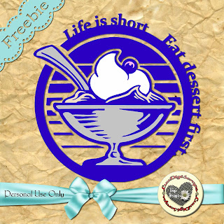
Life is Short. Really.

I'm kind of thinking about life. Since my dad passed away a couple of weeks ago, I noticed that my life is even more frenzied than before. My family is half a world away and they are going through their own motions. I have a son on a mission, summer just started, my daughter is now free to roam the neighborhood, thank goodness to good nearby friends.
I'd been thinking about this phrase for a few days, until I found the picture that I like better than the rest. Sometimes it's hard to decide on a design, because what you have doesn't help. I started out with a cute cupcake and was just going to add the words to the side and not worry much about it. Then I saw the round clip art and decided to go a different direction, which, of course took me longer. But I'm satisfied with the results.
Let me know what you think.

In any case, my dad was 74, and I think he lived a full life. I'm just going through different emotions right now, and contemplating my own mortality.
I'd like to give you a TIP: if you don't like the color of this one particular design all you have to do is colourize it with the hue you like better. Go to your color picker, click on the color you prefer, then click on Control and U, check the colorize square and move the saturation and lightness sliders until you get the look you want.
Let me know how you did, or if you have other questions.
Have a good one.
Patricia.

Monday, June 4, 2012

A Star

For your treasure chest of phrases to use on your digital scrapbooks comes today's freebie, a take on 'shining star.'
I used a simple shape: a star, and added the word shining in Accent font, then took out the necessary letters from the shape. The freebie is a .png file, you can use any style you want on it, or change it to a .ai file if you'd rather cut it with your digital cutter.
By the way, let me show you what it looks like when you apply a style to it. For this example I used one of Mithrilhall's bundle.

As you can probably tell, the posibilities are endless.
Have a great day.
Patricia.

Saturday, June 2, 2012

Kind Words

Don't you feel sometimes like a situation could be resolved just by saying kind words?
I can't put myself in every single situation that could come up between two or more people, but just from my own experience I know that sometimes I could've solved simple disagreements much quicker if I'd used soft, kind language.
So today I give this freebie (PU only) with those thoughts in mind. I used a paper that looked a bit grungy, colored it in chartreuse and gave it an embossed look (from Marbled Circle). I had a Chinese clip art that I wanted to use, I colored it in a dark chartreuse and then gave it a glassy look.
I did the letters in Vani and Venezio (if you don't have them, look in fonts.com or freefonts.com or dafont.com - through the years I've downloaded so many fonts from different places that I can't tell where they all came from - some I bought).
The frame came from a shape collection; I cut it in the same paper as the background: I wanted it to look as if rising from it. Then I beveled it. Same with the words 'kind' and 'spring.' And that's it.
I hope you enjoy it.
Have a great weekend.
Patricia.

Friday, June 1, 2012

June is Here!

Hi!
I want to have one graphic art for each month of the year.
I started this blog in April, so I have two others.
I like the idea of June bugs, so there it is.
Very simple, I used a clip art as a background and added the letters and bugs. Some of the additions come from KimC aka Kim Cameron, she has delicious clip art at different stores. June is done with the font United States.
As always, this is a freebie done in PSE 9.

Have a great new month and a safe weekend!
Patricia.